With the wild flurry of SOCIAL being such a hotbed topic for the last few years, some of us switched gears from focusing on Email Marketing to Social Marketing…
I am certainly a culprit of this sway. I was adding facebook comments on almost every landing page I had for the last year and a half and seeing a bit of a drop off from the email conversions on the page.
“But I’m getting more social proof?” I would rationalize to myself…
When did or does social proof fall into the equation?
Is it 1/3 social proof with Facebook comments and likes and 2/3 distinct calls to action and copy that makes a good landing page?
Well after talking with some buddies (on Facebook no less) I determined (with their help) that the best approach is to splash in some social proof but not so much to where it hinders a call to action conversion.
Remove Facebook Comments
from your landing pages.
This is just a suggestion, however a reason for this would be negative Nancies leaving negative comments just because it is their mission in life. A negative comment left by someone trolling around, could cause the rest of the incoming prospects to be turned off and click away from the page. Therefore instead of comments and a like button., just try for a like button and good call to actions.

Based on the ‘back to the basics’ movement, I wanted to create a nice list of some workable opt in strategies that really depend less on social media and more on getting the maximum number of opt ins in the least sleazy way.
These are ideas that I have seen and am in the process of rolling into my business…2013 is all about lead generation (Qualified leads)
Let’s Talk Gateway Splash Pages
NOT to be confused with the old ‘Search Killing’ flash splash pages that a lot of design firms do.
This is a Gateway splash page that has the sole purpose of collecting opt-ins/leads/subscribers.
This definitely gets back to the, don’t give them too many options concept. Either the prospect opts in, or leaves.
2 Popular Splash Page Options:
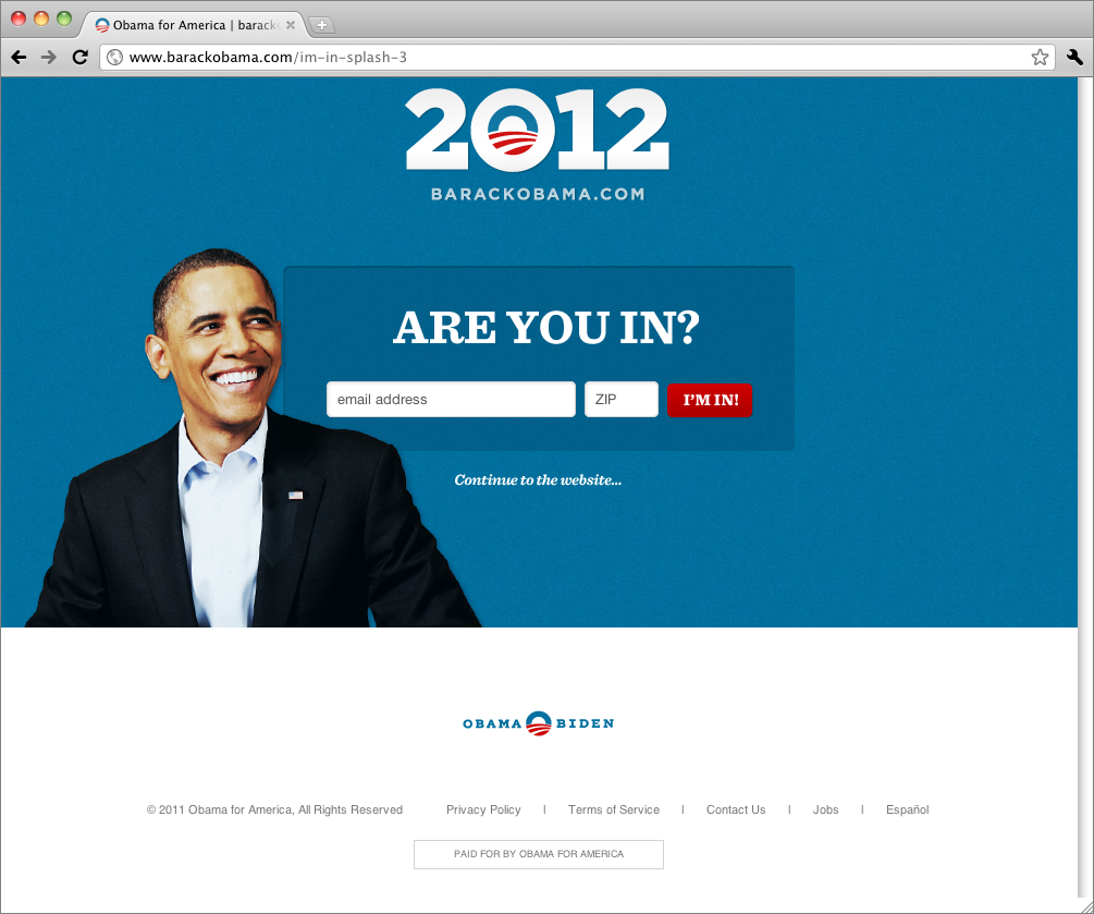
Barack style. 2012 we saw President Obama doing some cool stuff that felt very much in the wheel house of Internet Marketing. Is this the reason he was re-elected???? HMMMMMM
Well, I say heck yes. His market in 2012 was brilliant. Below you can see that a major strategy of his 2012 campaign was collecting leads (fans).
If you notice, Obama gives the option of either Joining…Or allowing you to continue to the website.
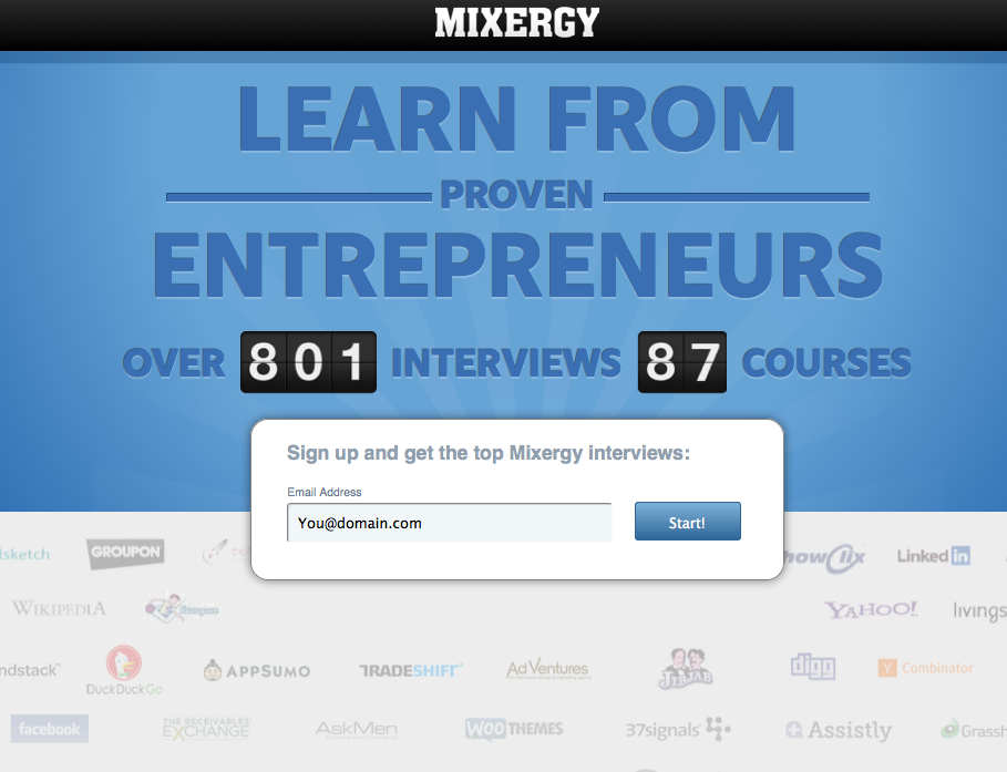
Mixergy ‘mixes’ it up a bit with a slight variation on that!
Mixergy doesn’t give an option for continuing on to the website.
Instead they have one option
Sign up to get the top Mixergy Interviews
I have to admit, in the case of the Obama splash page, if that was anyone other then Obama’s smiling face there, you really wouldn’t know what “Are you in” means.
Obama’s message is that you should sign up but we aren’t going to force you if you wanted to know more information, continue on to the site.
Then, once inside, the viewer is enticed to form a deeper relationship and eventually opt in.
In Mixergy’s case: The CTA (call to action) is pretty clear…and as such can hedge against people’s initial fears of performing an action. (I would be interested to see Mixergy to test out a Continue to the site feature to determine if there could be a greater follow of sign ups directly after the splash page because, let’s face it. Sometimes we need to know more or consume more before giving our information out. For instance, if someone is interested in a steak (a heartier look at your offer) and you have a red wine available (the option to opt in)
It’s easier to show both options for steak or red wine which gives them the power to choose.
Either way, if they choose red wine upfront (you get your optin). If they choose to eat the steak (bring them into the site), then you continue to offer up the red wine (deepening that relationship…loosing them up) why are they going to eventually opt in? Because your content and your offer complement each other so well that of course they would want both. I mean who doesn’t like a good red wine with steak!?
Limit Friction
-
Use fewer fields in the opt in form
By having more fields your chances of getting that lead drops lower and lower.
Consider taking them through a 2 step opt in sequence.
First get their email then get their name later.
-
Less Is More (Reign in your offer)
For a time, the concept of ‘give free’ was a predominant tactic.
This way of getting opt-ins is actually great for building your reputation.
However, what many of us, including me, was giving away WAY more content then we should. I was giving away an ebook + Video Course + Image package for Webinar Presentations + Free Webinar…
IT WAS WAY TOO MUCH!
Doing this can actually drop your value. Getting your followers into a habit of getting HUGE and vast content for free can make them wonder Why would I need to purchase anything at all from him when I can get an overwhelming amount of high quality value for free? Having all of these as gifts isn’t bad but don’t give them away right out of the gate. Strategize a delivery system…DON’T OVERWHELM…Maybe use them as a bonus for something later.
Tweeterrific Quote:
…Make your offer simple, digestible, and juicy…but not overwhelming!- @youtubejedi
Consider a short video course such as a 4 video series. The idea to the gift is to build trust.
The prospect needs to KNOW, LIKE and TRUST you.
Each video should be consumable. For instance at the most, 5 minutes long.
-
Tell them why they need your email.
Usually what happens is that we end up saying, “leave your email AND we will send you an ebook or video course”
Consider restructuring that. It’s all in the wording.
Don’t make the prospect or lead feel like you’re farming their information.
Let them know that you need their email so that you can send a response back via email with a private link to a 4 day video course.
Each day they can go into their email and find links to the course. This works very well.
What else works?
An email newsletter can do very well because it clearly defines why ones email is needed.
Implementable Strategy:
Consider providing a video starter course plus access to your newsletter also. You’re then enticing them with something juicy immediately, plud they understand why you need their emails via the newsletter.
-
Are you CTA Buttons Focusing on the right CTA?
The buttons on your landing page should add that final touch to the opting in process.
They should refer to what a person can get, the gateway into the prize so to speak.
When we create the pages, we focus on what our prospect have to do to get the prize rather then what we will do for them. (Focus on ME—meaning them)
Use examples like: “Access your Gift Now”, “Let Me In”, “Start” are great call to actions to consider using.
Exception to the Rule:
I would say that the only thing exception to these is a webinar registration form. It seems to be that people are still interested and fine with putting in their name and emails and even more information based on the premium level being given LIVE.
Are you using any of these strategies?
Let us know below and tell us if they are working for you or not working for you. We want to hear the TRUE GRIT here so spill everything.
Also how do you feel (personally) about using these strategies or tactics? Share some examples where you’ve seen them and if you thought they were awesome or spammy and tasteless.
And of course (while we are heavily on the subject), sign up below to get my email newsletter updates along with my ‘7 day video marketing bootcamp’ for free.



Casey,
very valuable suggestions – thanks for sharing your ideas so openly.
Only two questions left:
– why did you do a 13 minutes video and not just 3 minutes?
– why are you still allowing Facebook comments on this page?
Regards from Switzerland,
Urs
Hi Urs, I did go on a bit of a rant there in that video. Yes didnt quite edit down did I. Also this page is not a landing page. It is a blog post, and I was at Traffic and Conversion summit last month and there they discussed that Google is good with both Facebook and WP comments for engagement. That is why I have both on here. However, yes I have been thinking that it might be time to remove the Facebook comments from the page. There really is no need to have both…The only reason I guess would be that for every facebook comment, there is a link back to your wall.
Thanks for the response Urs!